making a grainy spotlight effect with CSS
I first saw this on Hakushi Hasegawa's website1 and after a little digging around in the source, saw that it was implemented with a shader and three.js
But I had a hunch that it might be possible with CSS blending modes. Not because I fully understood them, but just because it seemed like the sort of thing they're made for.
And as you can see, my hunch was correct, but as I write this sentence I still don't completely understand why.
They've been explained a million times by other people, but it's an open secret that blog posts like this are for me, not you, so here we go again:
What actually are blending modes?
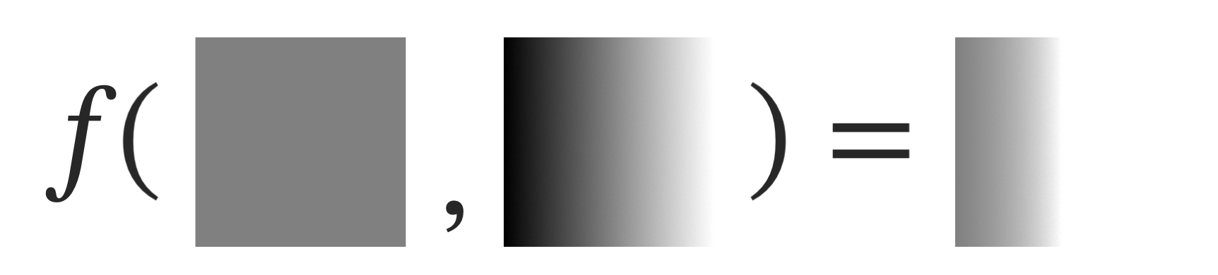
In a black and white image, every pixel can be represented as a value between 0 and 1.
0 is fully black. 1 is fully white.
Blending modes are rules for what should happen when you combine two of these numbers. For instance, the darken mode takes the lower of the two.
Or the multiply blending mode, which can be written as:
where
- is the base pixel value
- is the blend pixel value (the one on top with the blending mode set)
- is the output
If you have one pixel that is 0.5 (medium gray) and another that is 0.7 (light gray) and you blend them together with the multiply mode, you'll get a pixel that is 0.35.
And to be clear, this isn't just 3 divs with 3 different hexcodes. The third square you see is two divs stacked on top of one another with mix-blend-mode: multiply set on the top one.
need proof?
One thing you might take away from multiply is that it's not possible to get a lighter value than the values going into it. A fraction of a fraction is always smaller than the fraction itself.
How about the other blending modes? Expand for more details than the average person wants to know
I also plotted each of the non-conditional modes in desmos. It looks a bit like a modernist painting, but might also help you if you take the time to understand it.
Using blending modes as masks
So how do we use these tools to make the spotlight? The key is understanding that the abrupt edges of the color-dodge mode can turn a gradient into a mask.
With color-dodge, as the blend pixel approaches 1, the denominator approaches zero and the output value increases abruptly.
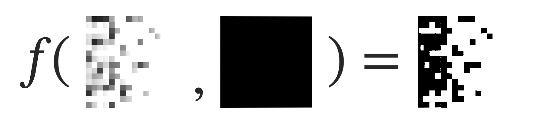
Here's a medium gray base layer and a black-to-white gradient blended over it using color-dodge
Think about what's happening here.
A is 0.5
B ranges from 0 to 1.
On the left, B is 0, so we're dividing 0.5 by 1, which equals 0.5 2
As B approaches 1, we start to divide A by a smaller and smaller number. When B is 0.5, we divide 0.5 by 0.5, which equals 1: pure white. Any higher value of B makes no difference because 1 is the lightest value possible.
As soon as the blend pixel becomes lighter than the base pixel, the output flips to white.
What if we blended a gradient over a noise texture?

Some of the noise pixels have slightly lightened, and many of them have turned fully white.
Effectively, what's happening is the computer is sampling each pixel and comparing it to the gradient. If the gradient is lighter, it hides the pixel. The further along the gradient you go, the more pixels get hidden.
Now all we need to do is make the remaining pixels black. Fortunately, there's another blend mode for that: color-burn
color-burn takes the inverse of your base layer, divides it by the blend layer, and then takes the inverse of that.
Let's color-burn a black layer over the color-dodge layer.
We start by picking one of the remaining visible pixels. Say we pick one that's dark gray (0.3)
- The inverse of dark gray is a light gray (0.7)
- The blend layer is black (0)
- 0.7 / 0 = Infinity
- 1 - Infinity = -Infinity
CSS can't display negative infinity: it clamps the value to 0. This is why all the gray pixels turn black: we're always going to be dividing them by zero.
But there's a special case! What if the pixel we sample is white? (1)
- The inverse of white is black (0)
- The blend layer is black (0)
- 0 / 0 = NaN
- 1 - NaN = NaN
NaN means "Not a Number", which is a special value used to represent undefined or unrepresentable numerical results. Fortunately for us, CSS renders these specific errors as white.3
And so there you have it. There's some artifacting going on due to tolerance for near-white values, but to recap:
- color-dodge "hides" pixels that are darker than the gradient.
- color-burn blackens the remaining pixels
This gives us a pixelated falloff based on the lightness of a gradient that we can overlay atop a noise layer.
Building the effect
Now that we understand the principle, let's build it step by step.
First, we create a div and center some text in it:
Then we place a new div above the text, with a noisy background image. Statically positioned elements' backgrounds paint first, which is why the absolutely positioned text is shown above it.
Then we place a div inside the noise layer and give it a radial-gradient from white to black.
Because the div is absolutely positioned, it's now painted above the text. We can set a darken blend on the darkness layer so that the darker black of the text shows through.
Now we can add mix-blend-mode: color-dodge to the spotlight div.
But wait, why doesn't the spotlight hide the text? Isn't white lighter than black?
Here's our layer structure:
<div class="container">
  <div class="text"> <3 </div>
  <div class="darkness">
    <div class="spotlight"></div>
  </div>
</div>
Nesting spotlight inside the noise layer puts it in a new stacking context.
When you set a blend mode on an element, it only blends with elements that are behind it in the same stacking context. To use a metaphor, the spotlight is inside a box (the noise layer). It can blend with the walls of its box, but it can't reach outside the box to blend with things sitting next to the box.
This changes how the box looks, but the box (the noise layer) is still blending with the text in its stacking context using darken.4
Finally, we add a new div over everything, with mix-blend-mode: color-burn and background: #414141 to turn all the remaining non-white pixels black.5
A little JavaScript to make the circle follow the mouse and you've got a spotlight!
If you'd asked me how blending modes worked before writing this, I would have said "by iterating through them until you find one that looks right."
I think that's still kind of the case. Experienced photographers probably have a stronger intuition about when to use a particular mode for adjusting one of their photos, but I'd be surprised if most of them don't also just tap the down arrow on the selector to preview what each of the modes would do.
And I could have implemented all of this with canvas and it would likely perform better, but I'd need to have learned the theory regardless, and it's cool to learn what's possible with regular CSS nowadays 🙂